Analyzing a MySQL database with R
In this article, we analyze a MySQL database which contains soccer transfer data, using the R environment, on OS X. We show in a few simple steps how you can link the two together.
** ** Prerequisites
Make sure you have a recent version of MySQL, and the latest version of R
installed. As our graphical user interface, we useRStudio. From RStudio you can install the MySQL package:install.packages("RMySQL"). If this doesn’t work for you, please refer to theinstallation instructions.
For plotting, install the ggplot2 library by issueing ainstall.packages("ggplot2") in RStudio. Alternatively, you can use the
graphical interface: in the bottom right panel, choose ‘Packages’ and click
‘Install Packages’. This presents you with a dialog to choose aCRAN mirror, and a prompt where you can enter the
package name.
Analysis
Our MySQL database contains a table transactions, which contains transaction
data. The transactions table has a column transfer_value of type float,
which is what we are interested in. First, we generate a big list of all the
transactions: SELECT transfer_value FROM transactions, which generates a MySQL
table with a single column that contains the transaction data.
First, let’s make sure the MySQL library is imported:
> library(RMySQL)
Next, we connect to our database, which is named soccer:
> con <- dbConnect(MySQL(), dbname="soccer")
Now we can start to issue queries:
> transfer_values <- dbGetQuery(con, "select transfer_value from transactions")
> summary(transfer_values)
transfer_value
Min.   :    5900
1st Qu.:  500000
Median : 1700000
Mean   : 3688301
3rd Qu.: 4500000
Max.   :94000000
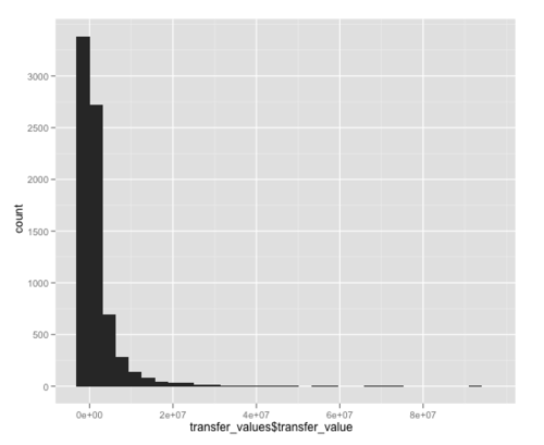
This shows us a summary of the transfer values. The maximum is 94 million, which
was Cristiano Ronaldo’s transfer to Real Madrid. To look at how the numbers are
distributed, we can plot them in a graph, using the qplot function from theggplot2 library, which is a convenience function that quickly generatesggplot plot objects.
> library(ggplot2)
> qplot(transfer_values$transfer_value)
This gives us a nice picture, which looks like a Power Law:
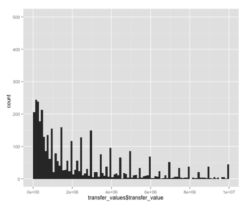
If we zoom in on the transfers up to 10 million, we get a more detailed picture, showing peaks at regular intervals: apparently, the soccer negotiators like nice round numbers too.
> qplot(transfer_values$transfer_value, xlim=c(0,1e07), binwidth=1e05, ylim=c(0,500))
For more info on the qplot command, you can type help(qplot), and RStudio
will show you the relevant help page on the bottom right.
Conclusion
Even though we did very basic analysis of the data, we have seen how to connect
R to MySQL and how to use the ggplot2 library to visualize the data.
Thanks to Peter Tegelaar for reading a draft of this post and helping with the code.
Update: see Hacker News for the discussion.