How To Visualize The Safe Area
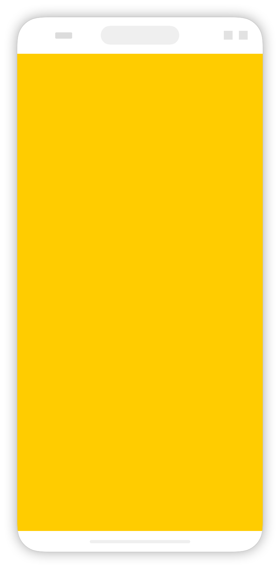
When we draw a SwiftUI view on screen, it only fills the safe area by default. For example, here we can see a yellow rectangle that fills the safe area, but leaves white space at the top and bottom of the screen.
Rectangle()
    .fill(Color.yellow)
We can change this behavior by adding the .ignoresSafeArea modifier:
Rectangle()
    .fill(Color.yellow)
    .ignoresSafeArea()
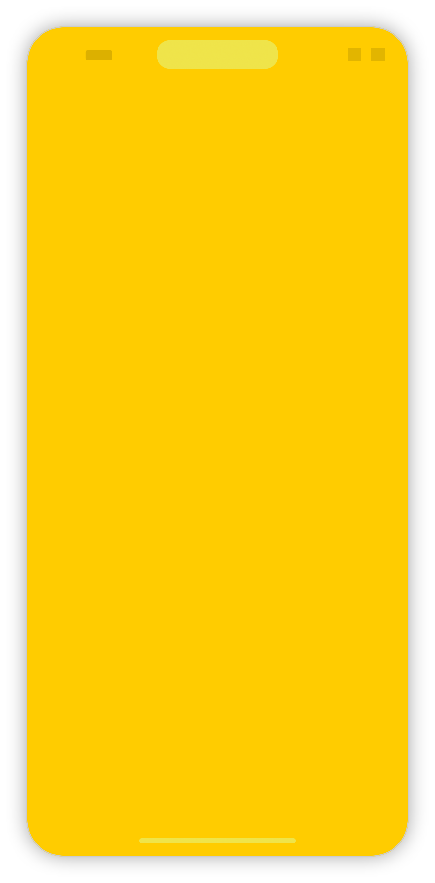
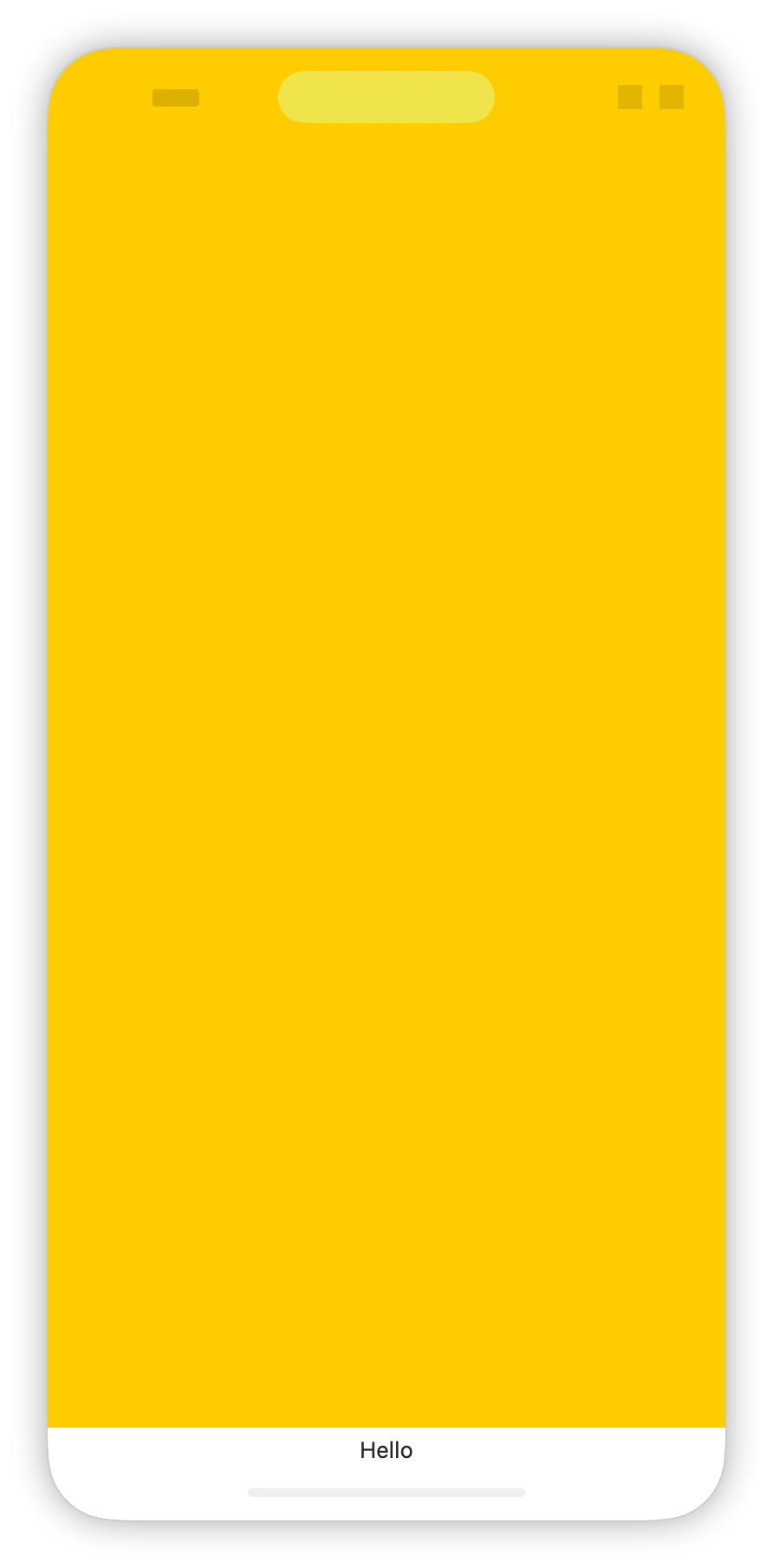
When the layout happens, the safe area insets are passed around to all the views that do layout. Whenever a border of a view marked with ignoresSafeArea touches the edge of the safe area, it will extend itself. For example, in the following view, the yellow color extends to the top but not to the bottom, as expected:
VStack {
    Color.yellow
        .ignoresSafeArea()
    Text("Hello")
}
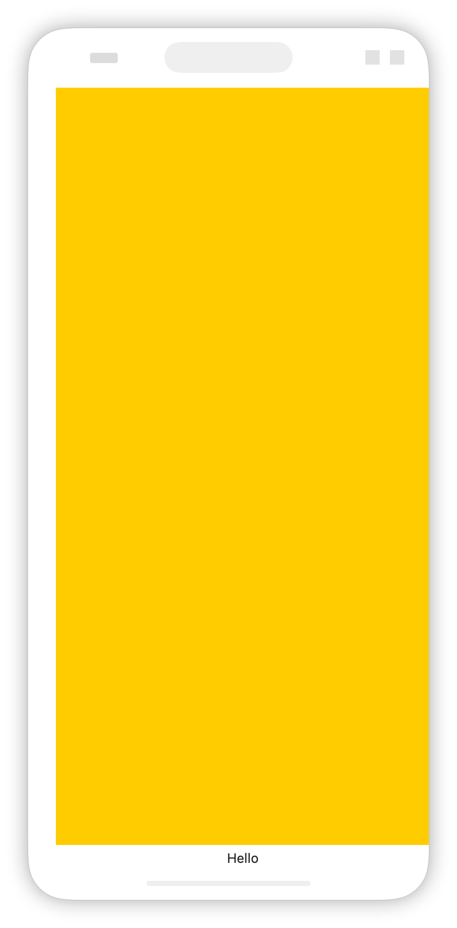
We can also make the safe area smaller (increase the insets) using a number of different modifiers. The safeAreaInset (available since iOS 15) allows us to add to the non-safe area. The yellow color will now respect the safe area, but can also use the ignoresSafeArea modifier to display beyond the safe area.
VStack {
    Color.yellow
    Text("Hello")
}
.safeAreaInset(edge: .leading) {
    Color.clear.frame(width: 20)
}
Insetting a view’s safe area with another view is not the same as placing the the views next to each other. For example, when we add a bottom safe area inset to a scroll view, the scroll view will draw itself behind that inset but also lets the user scroll so that all the content is visible:
myScrollView
    .safeAreaInset(edge: .bottom) {
        Text("This is my bottom view")
            .frame(height: 100)
            .frame(maxWidth: .infinity)
            .background(Material.regular)
    }

One of the interesting things is that we can visualize the safe area using an overlay and a geometry reader. We can add ignoresSafeArea to the geometry reader. Inside the geometry reader, we get access to the size of the safe area insets as well as the safe area size itself:
extension View {
    func visualizeSafeArea() -> some View {
        overlay {
            GeometryReader { proxy in
                ZStack {
                    VStack(spacing: 0) {
                        Color.yellow
                            .frame(height: proxy.safeAreaInsets.top)
                        Color.clear
                            .frame(height: proxy.size.height)
                        Color.red
                            .frame(height: proxy.safeAreaInsets.bottom)
                    }
                    HStack(spacing: 0) {
                        Color.green
                            .frame(width: proxy.safeAreaInsets.leading)
                        Color.clear
                            .frame(width: proxy.size.width)
                        Color.blue
                            .frame(width: proxy.safeAreaInsets.trailing)
                    }
                }
                .opacity(0.5)
                .ignoresSafeArea()
            }
        }
    }
}
Using the helper above, we can now visualize the safe area insets for any view. For example, let’s consider a gray rectangle that fills the safe area. We can see the yellow indicating the top safe area insets and the red indicating the bottom safe area insets:
Rectangle()
    .fill(Color.gray)
    .visualizeSafeArea()
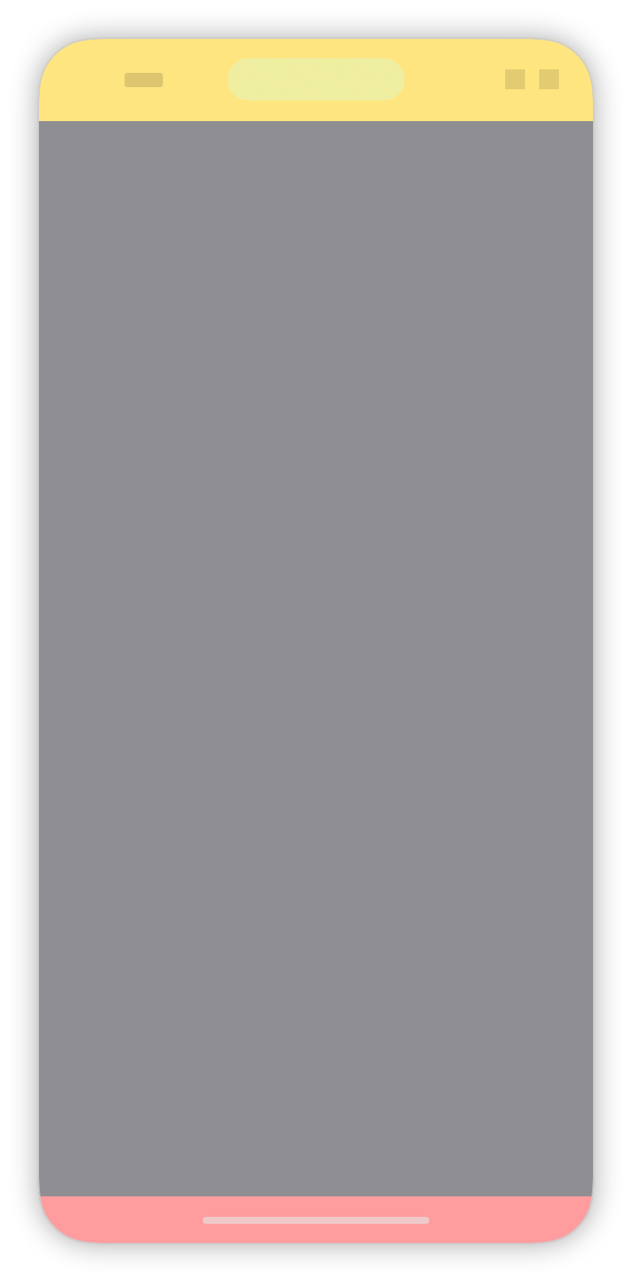
It’s interesting to play around with this helper, applying it at different points in the view hierarchy. It helped me gain a good understanding of how the safe area behaves and how to modify it for my own needs.
As always, if you’re interested how SwiftUI works below the hood, check out our book Thinking in SwiftUI. In fact, this post was inspired by a question from Ayman that we answered in our weekly Q&A.